
03
dynamo
branding // ui-ux design
This project was a massive effort to rebrand and build up a recognizable and memorable presence for Dynamo, completely transforming not only the logo but modernizing the brand identity as whole. This was a long term project that went through many stages, iterations, and production timelines. We set out to captivate our audience and invigorate our Dynamo family by showcasing spark and evoking energy.
DYNAMO
2017
ROLE
head of design
beyond the logo
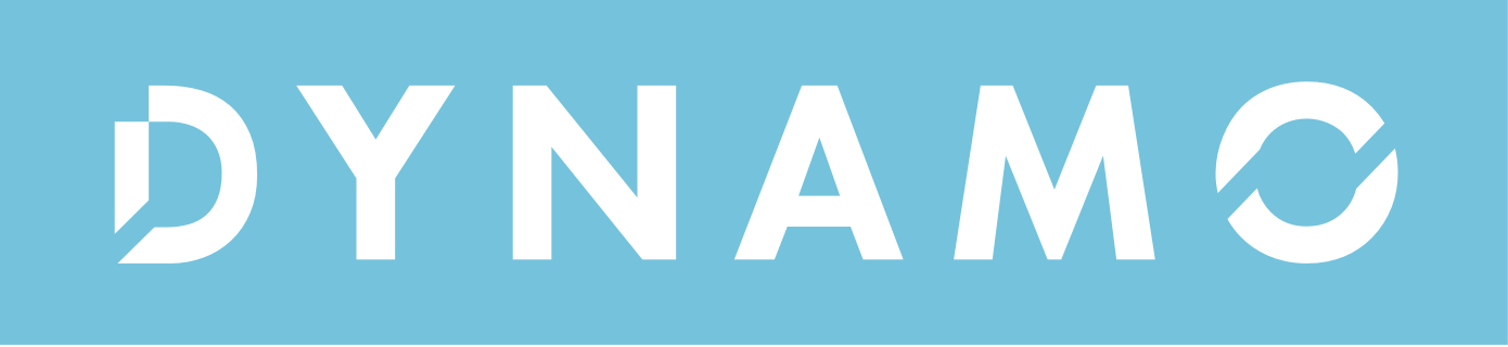
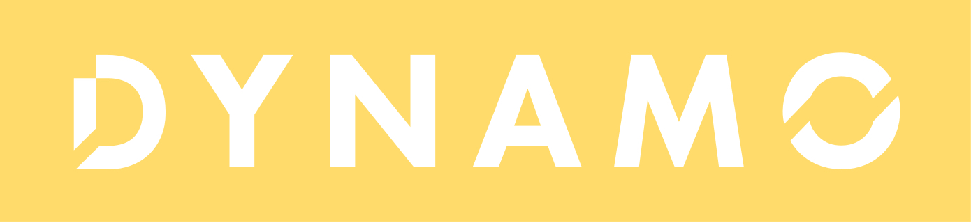

In order to delve into how best to represent Dynamo, we took a look inward and asked team members to define our culture. Bright, energetic, sincere, and concise were some the most popular adjectives. Using this inspiration we created a color palette to reflect this culture.

INSPIRING FROM WITHIN
Our excitement about this vibrant palette made it easy to build momentum as we integrated the brand throughout each layer of our organization. We empowered teams to use our brand with creativity and encouraged them to use the Dynamo Branding Guide as a resource. The culmination of the project was the complete redesign of our corporate website.
RESEARCH
PROJECT MGMT
BRAND STRATEGY
VISUAL IDENTITY
COLOR THEORY
PHOTO DIRECTION
SITEMAPPING
WIREFRAMING
PROTOTYPING
INTERACTION DESIGN
ILLUSTRATION
SWAG
GRID LAYOUTS
TYPOGRAPHY
ICONOGRAPHY
BRANDING GUIDE
TEMPLATES
UI-UX


THE visual presence
From the gitgo we wanted our visual presence to be strong and a reflection of our teams capabilities. Particularly because it serves as the public gateway to an understanding of Dynamo's spirit. Ultimately we were proud to launch the MVP and V1 - pending release.


